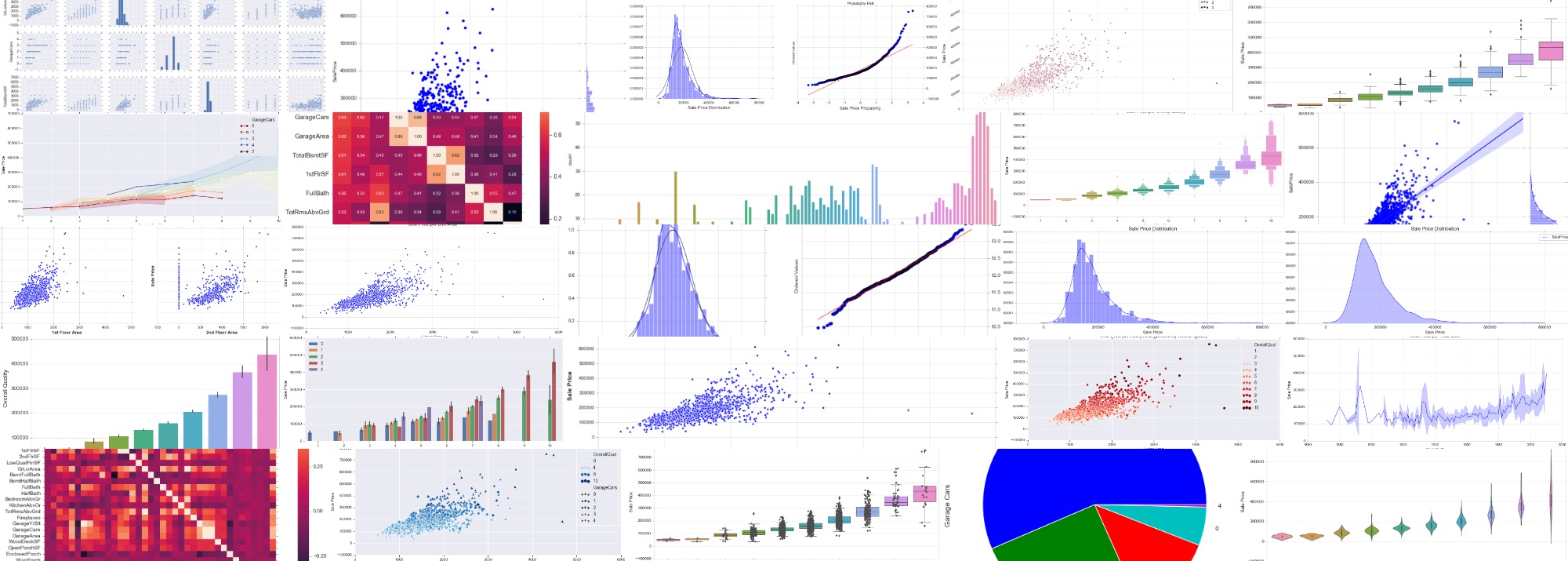

Visualizations with Seaborn
Everything seaborn does to create all kinds of plots is here.
Import Libraries
import numpy as np
import pandas as pd
import matplotlib.pyplot as plt

import plotly.plotly as py
from plotly.offline import init_notebook_mode, iplot
init_notebook_mode(connected=True)
import plotly.graph_objs as go

import seaborn as sns
from scipy import stats
from scipy.stats import norm
#so we dont have to write .plot()
%matplotlib inline
sns.set_style("whitegrid") #possible choices: white, dark, whitegrid, darkgrid, ticks
train = pd.read_csv('train.csv', sep=',')
test = pd.read_csv('test.csv', sep=',')
Dataset from kaggle
- SalePrice: - the property’s sale price in dollars. This is the target variable that you’re trying to predict.
- MSSubClass: The building class
- MSZoning: The general zoning classification
- LotFrontage: Linear feet of street connected to property
- LotArea: Lot size in square feet
- Street: Type of road access
- Alley: Type of alley access
- LotShape: General shape of property
- LandContour: Flatness of the property
- Utilities: Type of utilities available
- LotConfig: Lot configuration
- LandSlope: Slope of property
- Neighborhood: Physical locations within Ames city limits
- Condition1: Proximity to main road or railroad
- Condition2: Proximity to main road or railroad (if a second is present)
- BldgType: Type of dwelling
- HouseStyle: Style of dwelling
- OverallQual: Overall material and finish quality
- OverallCond: Overall condition rating
- YearBuilt: Original construction date
- YearRemodAdd: Remodel date
- RoofStyle: Type of roof
- RoofMatl: Roof material
- Exterior1st: Exterior covering on house
- Exterior2nd: Exterior covering on house (if more than one material)
- MasVnrType: Masonry veneer type
- MasVnrArea: Masonry veneer area in square feet
- ExterQual: Exterior material quality
- ExterCond: Present condition of the material on the exterior
- Foundation: Type of foundation
- BsmtQual: Height of the basement
- BsmtCond: General condition of the basement
- BsmtExposure: Walkout or garden level basement walls
- BsmtFinType1: Quality of basement finished area
- BsmtFinSF1: Type 1 finished square feet
- BsmtFinType2: Quality of second finished area (if present)
- BsmtFinSF2: Type 2 finished square feet
- BsmtUnfSF: Unfinished square feet of basement area
- TotalBsmtSF: Total square feet of basement area
- Heating: Type of heating
- HeatingQC: Heating quality and condition
- CentralAir: Central air conditioning
- Electrical: Electrical system
- 1stFlrSF: First Floor square feet
- 2ndFlrSF: Second floor square feet
- LowQualFinSF: Low quality finished square feet (all floors)
- GrLivArea: Above grade (ground) living area square feet
- BsmtFullBath: Basement full bathrooms
- BsmtHalfBath: Basement half bathrooms
- FullBath: Full bathrooms above grade
- HalfBath: Half baths above grade
- Bedroom: Number of bedrooms above basement level
- Kitchen: Number of kitchens
- KitchenQual: Kitchen quality
- TotRmsAbvGrd: Total rooms above grade (does not include bathrooms)
- Functional: Home functionality rating
- Fireplaces: Number of fireplaces
- FireplaceQu: Fireplace quality
- GarageType: Garage location
- GarageYrBlt: Year garage was built
- GarageFinish: Interior finish of the garage
- GarageCars: Size of garage in car capacity
- GarageArea: Size of garage in square feet
- GarageQual: Garage quality
- GarageCond: Garage condition
- PavedDrive: Paved driveway
- WoodDeckSF: Wood deck area in square feet
- OpenPorchSF: Open porch area in square feet
- EnclosedPorch: Enclosed porch area in square feet
- 3SsnPorch: Three season porch area in square feet
- ScreenPorch: Screen porch area in square feet
- PoolArea: Pool area in square feet
- PoolQC: Pool quality
- Fence: Fence quality
- MiscFeature: Miscellaneous feature not covered in other categories
- MiscVal: Value of miscellaneous feature
- MoSold: Month Sold
- YrSold: Year Sold
- SaleType: Type of sale
- SaleCondition: Condition of sale
Matplotlib Functions
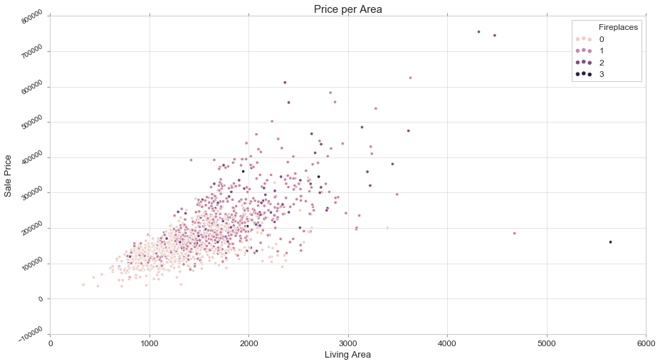
fig, ax = plt.subplots(figsize=(15,8))

sns.scatterplot(train['GrLivArea'], train['SalePrice'], hue=train['Fireplaces'])

ax.set_title('Price per Area', fontsize = 15, loc='center')
ax.set_ylabel('Sale Price', fontsize = 13)
ax.set_xlabel('Living Area', fontsize = 13)
plt.tick_params(axis='x', which='major', labelsize=12)
plt.tick_params(axis='y', which='major', labelsize=10)
ax.yaxis.tick_left() # where the y axis marks will be
plt.yticks(rotation=30)

ax.legend(loc='upper right') #if multiple figures, they have to contain label=''
<matplotlib.legend.Legend at 0x1fae5460f60>
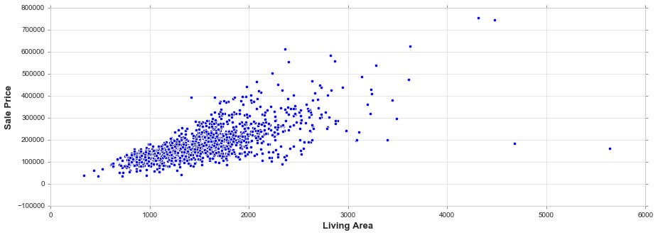
fig, ax = plt.subplots(figsize=(15, 5))
sns.scatterplot(train['GrLivArea'], train['SalePrice'])
ax.set_xlabel('Living Area', fontsize = 13, fontdict=dict(weight='bold'))
ax.set_ylabel('Sale Price', fontsize = 13, fontdict=dict(weight='bold'))
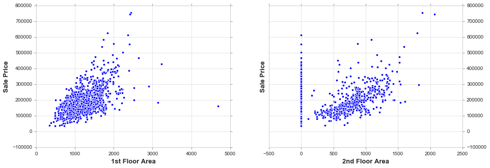
fig, ax = plt.subplots(nrows=1, ncols=2, figsize=(15, 5))
sns.scatterplot(train['1stFlrSF'], train['SalePrice'], ax=ax[0])
sns.scatterplot(train['2ndFlrSF'], train['SalePrice'], ax=ax[1])
ax[0].set_xlabel('1st Floor Area', fontsize = 13, fontdict=dict(weight='bold')); ax[0].set_ylabel('Sale Price', fontsize = 13, fontdict=dict(weight='bold'))
ax[1].set_xlabel('2nd Floor Area', fontsize = 13, fontdict=dict(weight='bold')); ax[1].set_ylabel('Sale Price', fontsize = 13, fontdict=dict(weight='bold'))
ax[1].yaxis.tick_right() # where the y axis marks will be
Univariate Analysis
Univariate analysis is the simplest form of data analysis where the data being analyzed contains only one variable. Since it’s a single variable it doesn’t deal with causes or relationships. The main purpose of univariate analysis is to describe the data and find patterns that exist within it
Histogram
Flexibly plot a univariate distribution of observations. https://seaborn.pydata.org/generated/seaborn.distplot.html
fig, ax = plt.subplots(figsize=(15, 5))

sns.distplot(train['SalePrice'])

ax.set_title('Sale Price Distribution', fontsize = 15, loc='center')
ax.set_xlabel('Sale Price', fontsize = 13)
plt.tick_params(axis='x', which='major', labelsize=12)
ax.yaxis.tick_left() # where the y axis marks will be
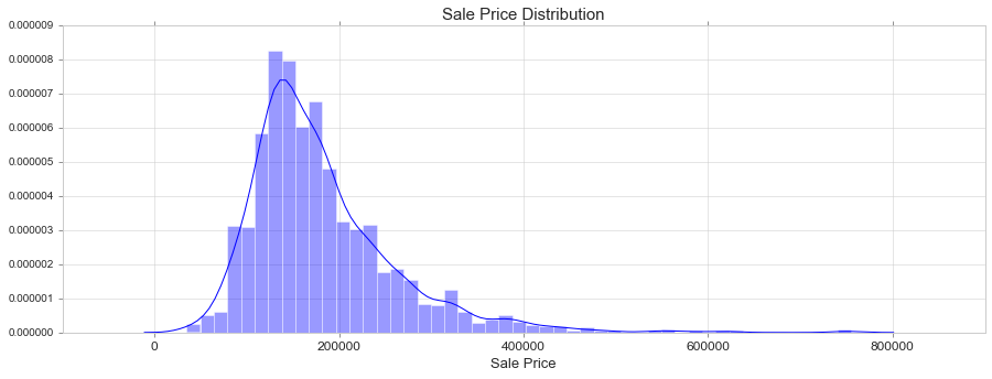
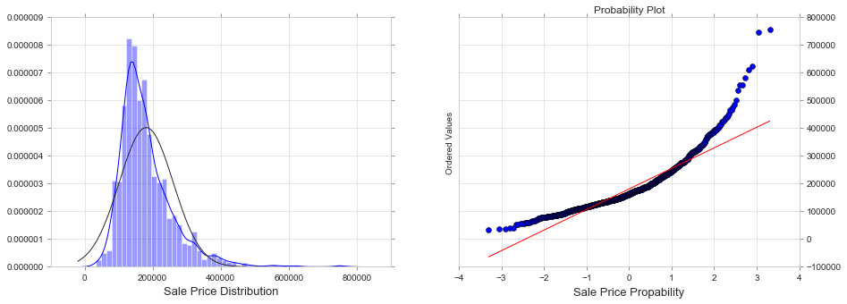
We see that the SalePrice:
- Deviate from the normal distribution.
- Have appreciable positive skewness.
- Show peakedness.
Skewness
It is the degree of distortion from the symmetrical bell curve or the normal distribution. It measures the lack of symmetry in data distribution. It differentiates extreme values in one versus the other tail. A symmetrical distribution will have a skewness of 0.
-
Positive Skewness means when the tail on the right side of the distribution is longer or fatter. The mean and median will be greater than the mode.
-
Negative Skewness is when the tail of the left side of the distribution is longer or fatter than the tail on the right side. The mean and median will be less than the mode.
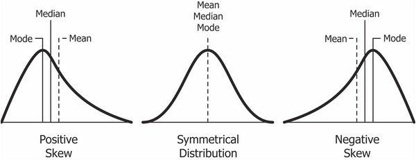
The rule of thumb seems to be:
- If the skewness is between -0.5 and 0.5, the data are fairly symmetrical.
- If the skewness is between -1 and -0.5(negatively skewed) or between 0.5 and 1(positively skewed), the data are moderately skewed.
- If the skewness is less than -1(negatively skewed) or greater than 1(positively skewed), the data are highly skewed.
In case of positive skewness, log transformations usually works well. The probability plot is a graphical technique for assessing whether or not a data set follows a given distribution such as the normal.
Kurtosis
It is all about the tails of the distribution — not the peakedness or flatness. It is used to describe the extreme values in one versus the other tail. It is actually the measure of outliers present in the distribution.
- High kurtosis in a data set is an indicator that data has heavy tails or outliers. If there is a high kurtosis, then, we need to investigate why do we have so many outliers. It indicates a lot of things, maybe wrong data entry or other things.
- Low kurtosis in a data set is an indicator that data has light tails or lack of outliers. If we get low kurtosis(too good to be true), then also we need to investigate and trim the dataset of unwanted results.
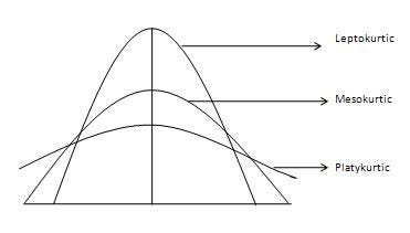
- Mesokurtic: This distribution has kurtosis statistic similar to that of the normal distribution. It means that the extreme values of the distribution are similar to that of a normal distribution characteristic. This definition is used so that the standard normal distribution has a kurtosis of three.
- Leptokurtic (Kurtosis > 3): Distribution is longer, tails are fatter. Peak is higher and sharper than Mesokurtic, which means that data are heavy-tailed or profusion of outliers. Outliers stretch the horizontal axis of the histogram graph, which makes the bulk of the data appear in a narrow (“skinny”) vertical range, thereby giving the “skinniness” of a leptokurtic distribution.
- Platykurtic: (Kurtosis < 3): Distribution is shorter, tails are thinner than the normal distribution. The peak is lower and broader than Mesokurtic, which means that data are light-tailed or lack of outliers. The reason for this is because the extreme values are less than that of the normal distribution.
print("Skewness: {:.3f}".format(train['SalePrice'].skew()))
print("Kurtosis: {:.3f}". format(train['SalePrice'].kurt()))
Skewness: 1.883
Kurtosis: 6.536
fig, ax = plt.subplots(nrows=1, ncols=2, figsize=(15, 5))
sns.distplot(train['SalePrice'], fit=norm, ax=ax[0])
stats.probplot(train['SalePrice'], plot=plt)
ax[0].set_xlabel('Sale Price Distribution', fontsize = 13)
ax[1].set_xlabel('Sale Price Propability', fontsize = 13)
ax[1].yaxis.tick_right() # where the y axis marks will be
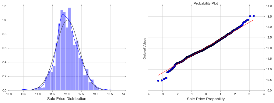
train['SalePrice'] = np.log(train['SalePrice'])

fig, ax = plt.subplots(nrows=1, ncols=2, figsize=(15, 5))
sns.distplot(train['SalePrice'], fit=norm, ax=ax[0])
stats.probplot(train['SalePrice'], plot=plt)
ax[0].set_xlabel('Sale Price Distribution', fontsize = 13)
ax[1].set_xlabel('Sale Price Propability', fontsize = 13)
ax[1].yaxis.tick_right() # where the y axis marks will be
#Let's load again the dataset
train = pd.read_csv('train.csv', sep=',')
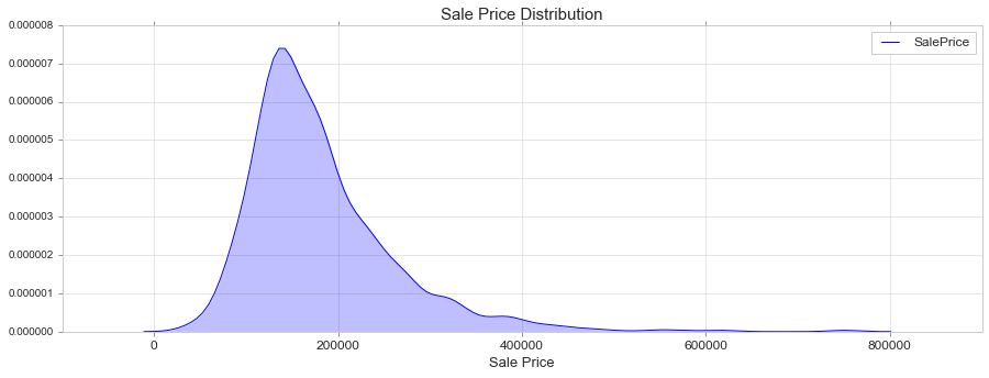
KDE Plot
Fit and plot a univariate or bivariate kernel density estimate. https://seaborn.pydata.org/generated/seaborn.kdeplot.html
fig, ax = plt.subplots(figsize=(15, 5))

sns.kdeplot(train['SalePrice'], shade=True)

ax.set_title('Sale Price Distribution', fontsize = 15, loc='center')
ax.set_xlabel('Sale Price', fontsize = 13)
plt.tick_params(axis='x', which='major', labelsize=12)
ax.yaxis.tick_left() # where the y axis marks will be
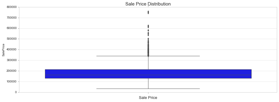
Box Plot
Draw a box plot to show distributions with respect to categories. https://seaborn.pydata.org/generated/seaborn.boxplot.html
fig, ax = plt.subplots(figsize=(15, 5))

sns.boxplot(train['SalePrice'], orient = 'v')

ax.set_title('Sale Price Distribution', fontsize = 15, loc='center')
ax.set_xlabel('Sale Price', fontsize = 13)
plt.tick_params(axis='x', which='major', labelsize=12)
ax.yaxis.tick_left() # where the y axis marks will be
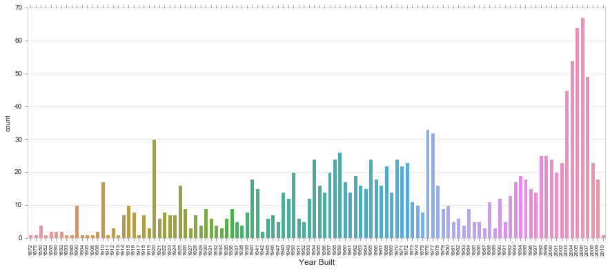
Count Plot
Show the counts of observations in each categorical bin using bars. A count plot can be thought of as a histogram across a categorical, instead of quantitative, variable.
https://seaborn.pydata.org/generated/seaborn.countplot.html
fig, ax = plt.subplots(figsize=(15,6))

sns.countplot(train['YearBuilt'])

plt.xticks(rotation=90)
ax.set_xlabel('Year Built', fontsize = 12)
plt.tick_params(axis='x', which='major', labelsize=8)
ax.yaxis.tick_left() # where the y axis marks will be
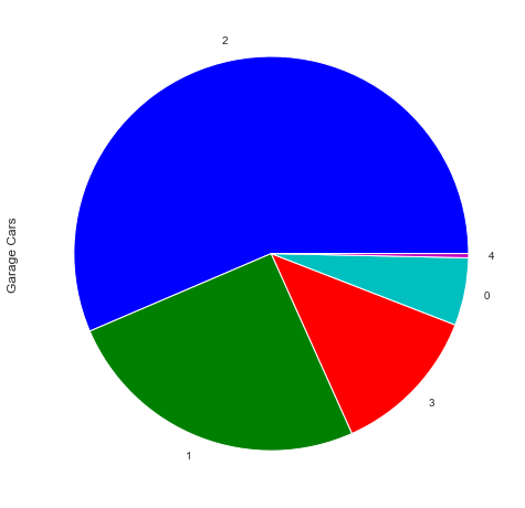
Pie Chart
f,ax=plt.subplots(figsize=(8,8))
train['GarageCars'].value_counts().plot(kind='pie')

ax.set_ylabel('Garage Cars', fontsize = 12)
<matplotlib.text.Text at 0x1fae90a93c8>
Bivariate Analysis
Bivariate analysis is used to find out if there is a relationship between two different variables.
Continious
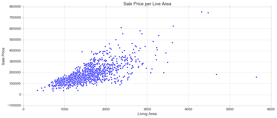
Scatter Plot
Draw a scatter plot with possibility of several semantic groupings. https://seaborn.pydata.org/generated/seaborn.scatterplot.html
fig, ax = plt.subplots(figsize=(15, 6))

sns.scatterplot(train['GrLivArea'], train['SalePrice'])

ax.set_title('Sale Price per Live Area', fontsize = 15, loc='center')
ax.set_xlabel('Livινg Area', fontsize = 13)
ax.set_ylabel('Sale Price', fontsize = 13)
plt.tick_params(axis='y', which='major', labelsize=12)
plt.tick_params(axis='x', which='major', labelsize=12)
ax.yaxis.tick_left() # where the y axis marks will be
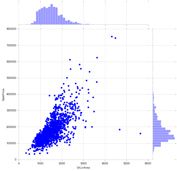
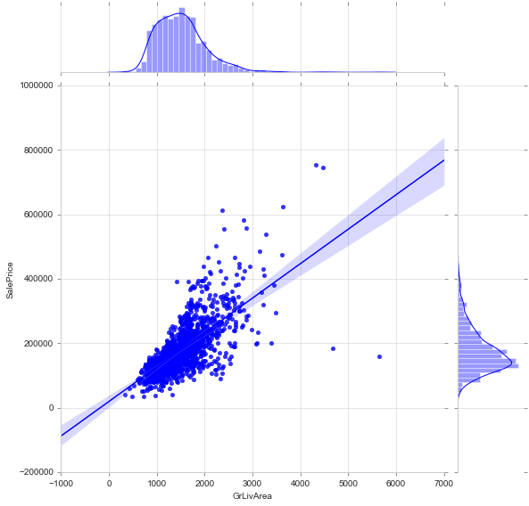
Join Plot (scatter)
Draw a plot of two variables with bivariate and univariate graphs. https://seaborn.pydata.org/generated/seaborn.jointplot.html
sns.jointplot(train['GrLivArea'], train['SalePrice'], height=8, kind='scatter')
<seaborn.axisgrid.JointGrid at 0x1fae90bb0b8>
Join Plot (reg) or lm Plot
#alternative: sns.lmplot(x='GrLivArea', y='SalePrice', data=train)
sns.jointplot(train['GrLivArea'], train['SalePrice'], height=8, kind='reg')
<seaborn.axisgrid.JointGrid at 0x1fae7a4c3c8>
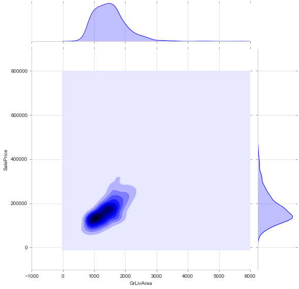
Join Plot (kde) or kde Plot
#alternative: sns.kdeplot(train['GrLivArea'], train['SalePrice'], shade=True)
sns.jointplot(train['GrLivArea'], train['SalePrice'], height=8, kind='kde')
c:\users\jim\appdata\local\programs\python\python35\lib\site-packages\numpy\ma\core.py:6461: MaskedArrayFutureWarning:

In the future the default for ma.minimum.reduce will be axis=0, not the current None, to match np.minimum.reduce. Explicitly pass 0 or None to silence this warning.

c:\users\jim\appdata\local\programs\python\python35\lib\site-packages\numpy\ma\core.py:6461: MaskedArrayFutureWarning:

In the future the default for ma.maximum.reduce will be axis=0, not the current None, to match np.maximum.reduce. Explicitly pass 0 or None to silence this warning.


<seaborn.axisgrid.JointGrid at 0x1fae7b7ba90>
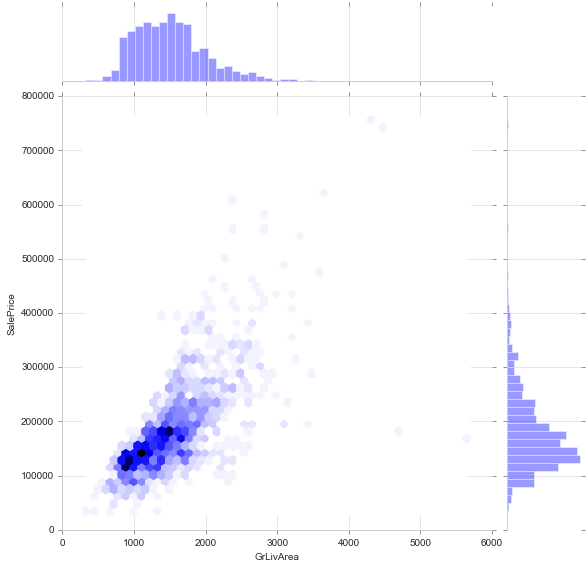
Join Plot (hex)
sns.jointplot(train['GrLivArea'], train['SalePrice'], height=8, kind='hex')
<seaborn.axisgrid.JointGrid at 0x1fae7dba278>
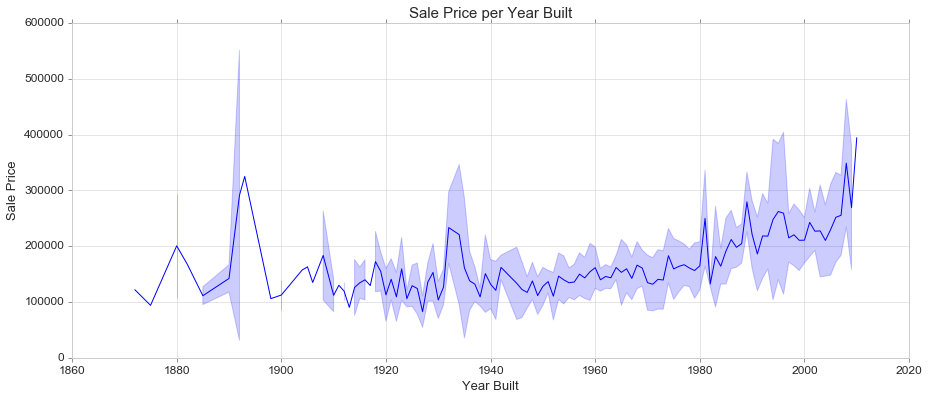
Line Plot (alternatives: pointplot, relplot)
Draw a line plot with possibility of several semantic groupings.
The relationship between x and y can be shown for different subsets of the data using the hue, size, and style parameters. These parameters control what visual semantics are used to identify the different subsets. It is possible to show up to three dimensions independently by using all three semantic types, but this style of plot can be hard to interpret and is often ineffective. Using redundant semantics (i.e. both hue and style for the same variable) can be helpful for making graphics more accessible.
https://seaborn.pydata.org/generated/seaborn.lineplot.html
fig, ax = plt.subplots(figsize=(15, 6))

sns.lineplot(train['YearBuilt'], train['SalePrice'], ci='sd' ) #'sd' shows the std

ax.set_title('Sale Price per Year Built', fontsize = 15, loc='center')
ax.set_xlabel('Year Built', fontsize = 13)
ax.set_ylabel('Sale Price', fontsize = 13)
plt.tick_params(axis='y', which='major', labelsize=12)
plt.tick_params(axis='x', which='major', labelsize=12)
ax.yaxis.tick_left() # where the y axis marks will be
Categorical
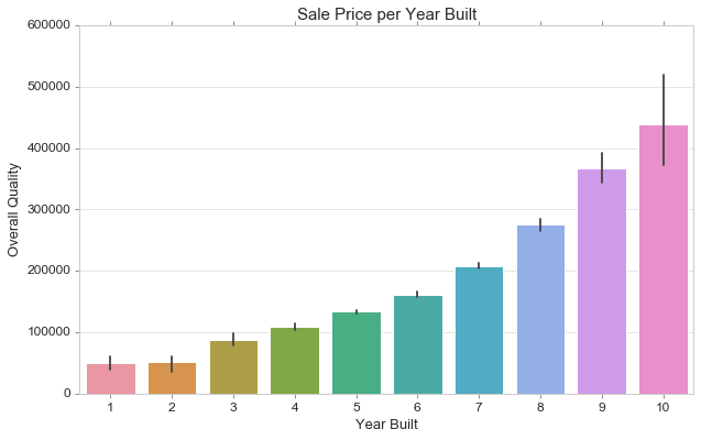
Bar Plot
Show point estimates and confidence intervals as rectangular bars.
A bar plot represents an estimate of central tendency for a numeric variable with the height of each rectangle and provides some indication of the uncertainty around that estimate using error bars. Bar plots include 0 in the quantitative axis range, and they are a good choice when 0 is a meaningful value for the quantitative variable, and you want to make comparisons against it.
https://seaborn.pydata.org/generated/seaborn.barplot.html
fig, ax = plt.subplots(figsize=(10,6))

sns.barplot(train['OverallQual'], train['SalePrice'])

ax.set_title('Sale Price per Year Built', fontsize = 15, loc='center')
ax.set_xlabel('Year Built', fontsize = 13)
ax.set_ylabel('Overall Quality', fontsize = 13)
plt.tick_params(axis='y', which='major', labelsize=12)
plt.tick_params(axis='x', which='major', labelsize=12)
ax.yaxis.tick_left() # where the y axis marks will be
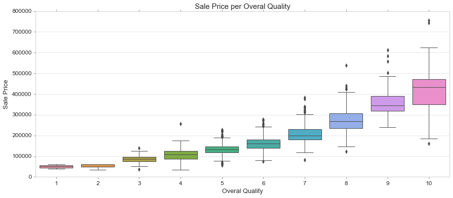
Boxplot
https://seaborn.pydata.org/generated/seaborn.boxplot.html
fig, ax = plt.subplots(figsize=(15, 6))

sns.boxplot(train['OverallQual'], train['SalePrice'])

ax.set_title('Sale Price per Overal Quality', fontsize = 15, loc='center')
ax.set_xlabel('Overal Quality', fontsize = 13)
ax.set_ylabel('Sale Price', fontsize = 13)
plt.tick_params(axis='y', which='major', labelsize=12)
plt.tick_params(axis='x', which='major', labelsize=12)
ax.yaxis.tick_left() # where the y axis marks will be
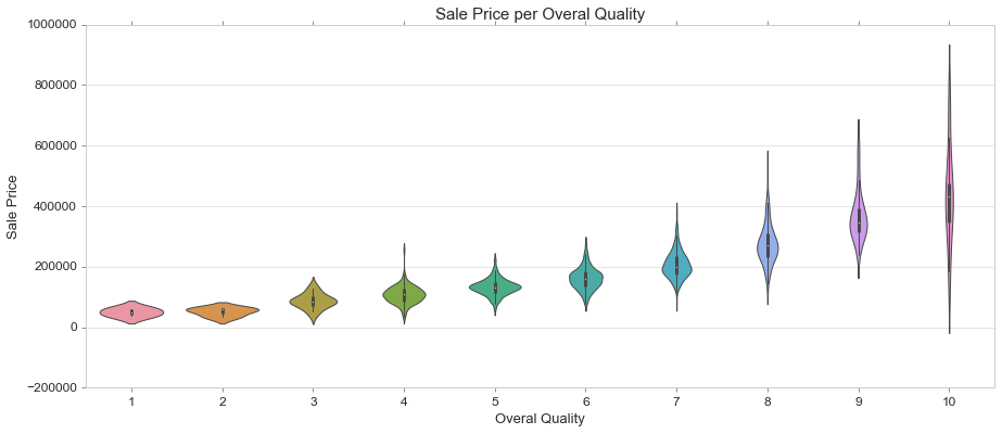
Violin Plot
Draw a combination of boxplot and kernel density estimate.
A violin plot plays a similar role as a box and whisker plot. It shows the distribution of quantitative data across several levels of one (or more) categorical variables such that those distributions can be compared. Unlike a box plot, in which all of the plot components correspond to actual datapoints, the violin plot features a kernel density estimation of the underlying distribution.
This can be an effective and attractive way to show multiple distributions of data at once, but keep in mind that the estimation procedure is influenced by the sample size, and violins for relatively small samples might look misleadingly smooth.
https://seaborn.pydata.org/generated/seaborn.violinplot.html
fig, ax = plt.subplots(figsize=(15, 6))

sns.violinplot(train['OverallQual'], train['SalePrice'])

ax.set_title('Sale Price per Overal Quality', fontsize = 15, loc='center')
ax.set_xlabel('Overal Quality', fontsize = 13)
ax.set_ylabel('Sale Price', fontsize = 13)
plt.tick_params(axis='y', which='major', labelsize=12)
plt.tick_params(axis='x', which='major', labelsize=12)
ax.yaxis.tick_left() # where the y axis marks will be
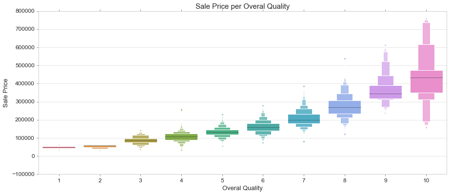
Boxen Plot
Draw an enhanced box plot for larger datasets.
This style of plot was originally named a “letter value” plot because it shows a large number of quantiles that are defined as “letter values”. It is similar to a box plot in plotting a nonparametric representation of a distribution in which all features correspond to actual observations. By plotting more quantiles, it provides more information about the shape of the distribution, particularly in the tails.
https://seaborn.pydata.org/generated/seaborn.boxenplot.html#seaborn.boxenplot
fig, ax = plt.subplots(figsize=(15, 6))

sns.boxenplot(train['OverallQual'], train['SalePrice'])

ax.set_title('Sale Price per Overal Quality', fontsize = 15, loc='center')
ax.set_xlabel('Overal Quality', fontsize = 13)
ax.set_ylabel('Sale Price', fontsize = 13)
plt.tick_params(axis='y', which='major', labelsize=12)
plt.tick_params(axis='x', which='major', labelsize=12)
ax.yaxis.tick_left() # where the y axis marks will be
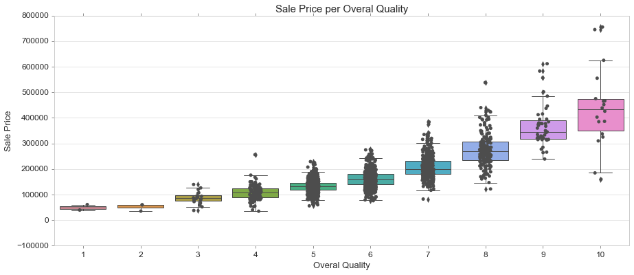
Strip Plot on Box Plot
A strip plot can be drawn on its own, but it is also a good complement to a box or violin plot in cases where you want to show all observations along with some representation of the underlying distribution.
https://seaborn.pydata.org/generated/seaborn.stripplot.html
fig, ax = plt.subplots(figsize=(15, 6))

sns.boxplot(train['OverallQual'], train['SalePrice']) #or violinplot
sns.stripplot(train['OverallQual'], train['SalePrice'], color=".3")

ax.set_title('Sale Price per Overal Quality', fontsize = 15, loc='center')
ax.set_xlabel('Overal Quality', fontsize = 13)
ax.set_ylabel('Sale Price', fontsize = 13)
plt.tick_params(axis='y', which='major', labelsize=12)
plt.tick_params(axis='x', which='major', labelsize=12)
ax.yaxis.tick_left() # where the y axis marks will be
Multivariate Analysis
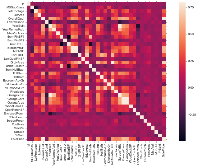
Correlation Heatmap
corrmat = train.corr()
fig, ax = plt.subplots(figsize=(15,8))
sns.heatmap(corrmat, vmax=.8, square=True);
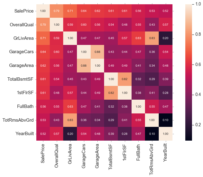
fig, ax = plt.subplots(figsize=(15,8))
k = 10 #number of variables for heatmap
cols = corrmat.nlargest(k, 'SalePrice')['SalePrice'].index
cm = np.corrcoef(train[cols].values.T)
sns.set(font_scale=1.25)
sns.heatmap(cm, cbar=True, annot=True, square=True, fmt='.2f', annot_kws={'size': 10}, yticklabels=cols.values, xticklabels=cols.values)
<matplotlib.axes._subplots.AxesSubplot at 0x1faea1bb4e0>
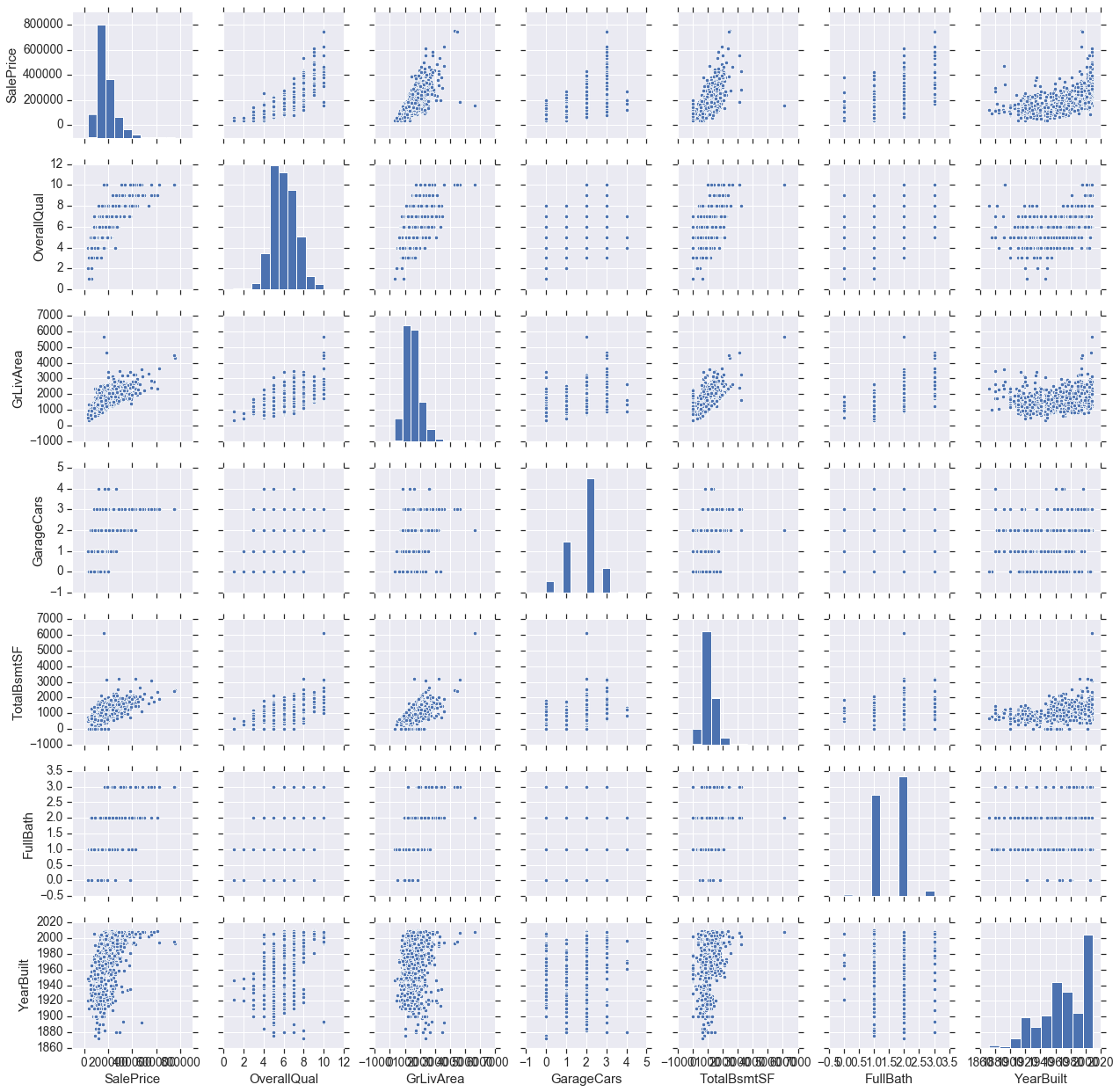
Pairplot
cols = ['SalePrice', 'OverallQual', 'GrLivArea', 'GarageCars', 'TotalBsmtSF', 'FullBath', 'YearBuilt']
sns.pairplot(train[cols], height = 2.5)
<seaborn.axisgrid.PairGrid at 0x1faea159a90>
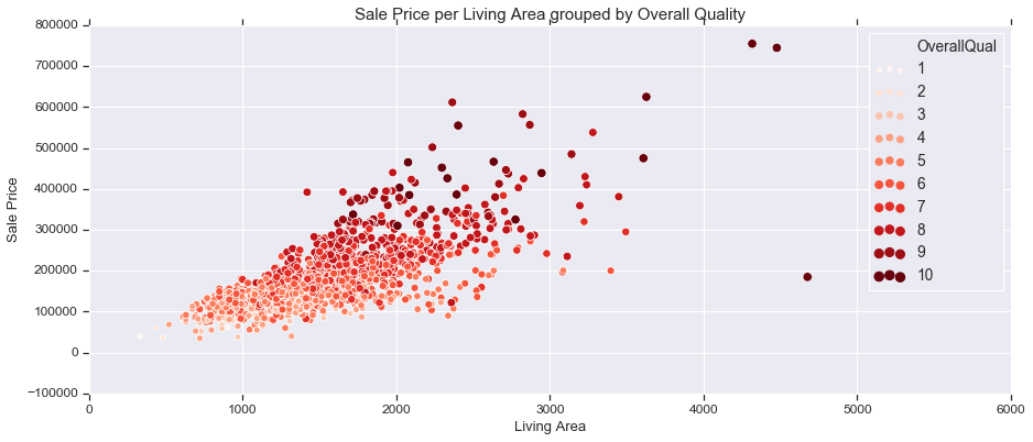
3 Variables with Scatter Plot
fig, ax = plt.subplots(figsize=(15,6))

sns.scatterplot(train['GrLivArea'], train['SalePrice'], hue=train['OverallQual'], palette='Reds', size=train['OverallQual'],
               legend="full")

ax.set_title('Sale Price per Living Area grouped by Overall Quality', fontsize = 15, loc='center')
ax.set_xlabel('Living Area', fontsize = 13)
ax.set_ylabel('Sale Price', fontsize = 13)
plt.tick_params(axis='y', which='major', labelsize=12)
plt.tick_params(axis='x', which='major', labelsize=12)
ax.yaxis.tick_left() # where the y axis marks will be
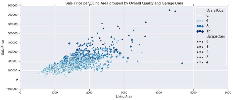
4 Variables with Scatter Plot
fig, ax = plt.subplots(figsize=(15,6))

sns.scatterplot(train['GrLivArea'], train['SalePrice'], hue=train['OverallQual'], palette='Blues', style=train['GarageCars'],
               size=train['OverallQual'])

ax.set_title('Sale Price per Living Area grouped by Overall Quality and Garage Cars', fontsize = 15, loc='center')
ax.set_xlabel('Living Area', fontsize = 13)
ax.set_ylabel('Sale Price', fontsize = 13)
plt.tick_params(axis='y', which='major', labelsize=12)
plt.tick_params(axis='x', which='major', labelsize=12)
ax.yaxis.tick_left() # where the y axis marks will be
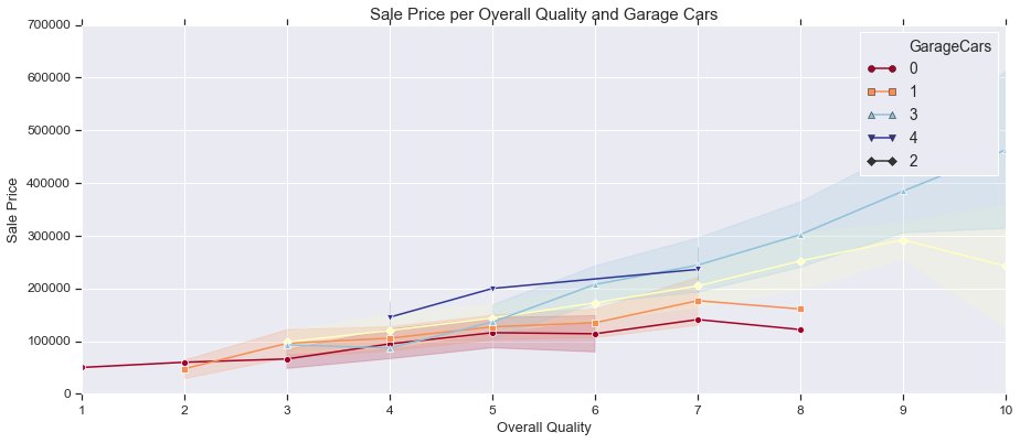
3 Variables with Line Plot
fig, ax = plt.subplots(figsize=(15,6))

sns.lineplot(train['OverallQual'], train['SalePrice'], ci='sd' ,hue=train['GarageCars'], palette='RdYlBu',
            style=train['GarageCars'], markers=True, dashes=False)

ax.set_title('Sale Price per Overall Quality and Garage Cars', fontsize = 15, loc='center')
ax.set_xlabel('Overall Quality', fontsize = 13)
ax.set_ylabel('Sale Price', fontsize = 13)
plt.tick_params(axis='y', which='major', labelsize=12)
plt.tick_params(axis='x', which='major', labelsize=12)
ax.yaxis.tick_left() # where the y axis marks will be
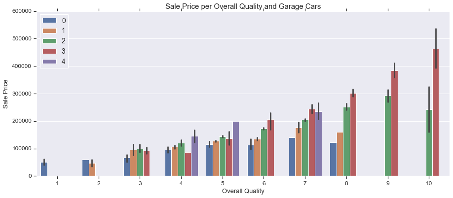
3 Variables with Bar Plot
fig, ax = plt.subplots(figsize=(15,6))
sns.barplot(train['OverallQual'], train['SalePrice'], hue=train['GarageCars'])
ax.legend(loc='upper left')

ax.set_title('Sale Price per Overall Quality and Garage Cars', fontsize = 15, loc='center')
ax.set_xlabel('Overall Quality', fontsize = 13)
ax.set_ylabel('Sale Price', fontsize = 13)
plt.tick_params(axis='y', which='major', labelsize=12)
plt.tick_params(axis='x', which='major', labelsize=12)
ax.yaxis.tick_left() # where the y axis marks will be
Leave a Comment